I have a client who moved into a darling one bedroom apartment dubbed “the club house”. Her apartment is chock-a-block full of *interesting* architectural details that create quite the decorating dilemma. Most of these challenges will be documented in forth coming posts – do I know how to tantalize the reader or what?
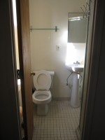
The first room to receive a complete transformation was the teeny tiny bathroom. This small scale space has 2 windows that really bathe the room with sunlight, unfortunately the previous tenant thought covering said windows with checkered contact paper was an inexpensive alternative to curtains to ensure privacy.
Lesson to be learned: contact paper on glass exposed to the sun will bake and permanently adhere to the surface – for a rental property, not a wise choice.
Aside from that unsightly issue, the landlord made the odd (read: cheap) choice of painting the bathroom in flat paint which shows every water mark and is difficult to clean. Not to mention does not inhibit mold growth. Not interested in repainting the room, I found an inexpensive and removable wall covering that would reflect light, clean easily and be untraceable once the client vacates the premises.
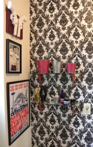
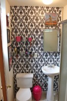
Although it may seem counterintuitive to cover the wall, the door front (that is for another post) and previously covered lower windows with such a bold and repetitive pattern, it actually opened the room and created a focal point. The black & white damask pattern plays the perfect backdrop for the clients’ assortment of punk & rock inspired art work that didn’t jive with the rest of her collection thus creating a mini gallery space.
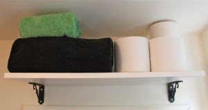
Another disadvantage to this diminutive space was the lack of storage capabilities. A shelf with previously affixed brackets had been retrieved from the client’s previous residence and hung over the doorframe to store extra towels and toiletries. The original shelf was removed and replaced with 2 custom cut glass shelves and placed on sets of decorative brackets found on deep discount at Anthropology.
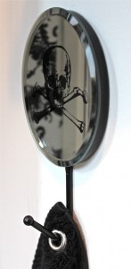
Since hanging a towel rack wasn’t a viable option, 2 mirrored hooks that once held necklaces were put to task as hand towel hangers to the right of the sink. To prevent the towels from slipping and minimize bulk, I opted to place grommets in the upper left corner for a sleek and straight look.
Now the loo (an homage to my client’s English heritage) looks ladylike, polished and proper (and a little punk too – in a pretty way.)
Is it time to upgrade your lavatory to lovely?
xxoo.





Amazing what you can do with such a small and basically ugly space. Nice job.
Love this loo-especially the great additions for clever out of the way storage! Also like the grommet. How does one add grommets on? And where can they be found?
very cute!
So cute! Well done! Love the wallpaper.